The mission
Аpplication interface design
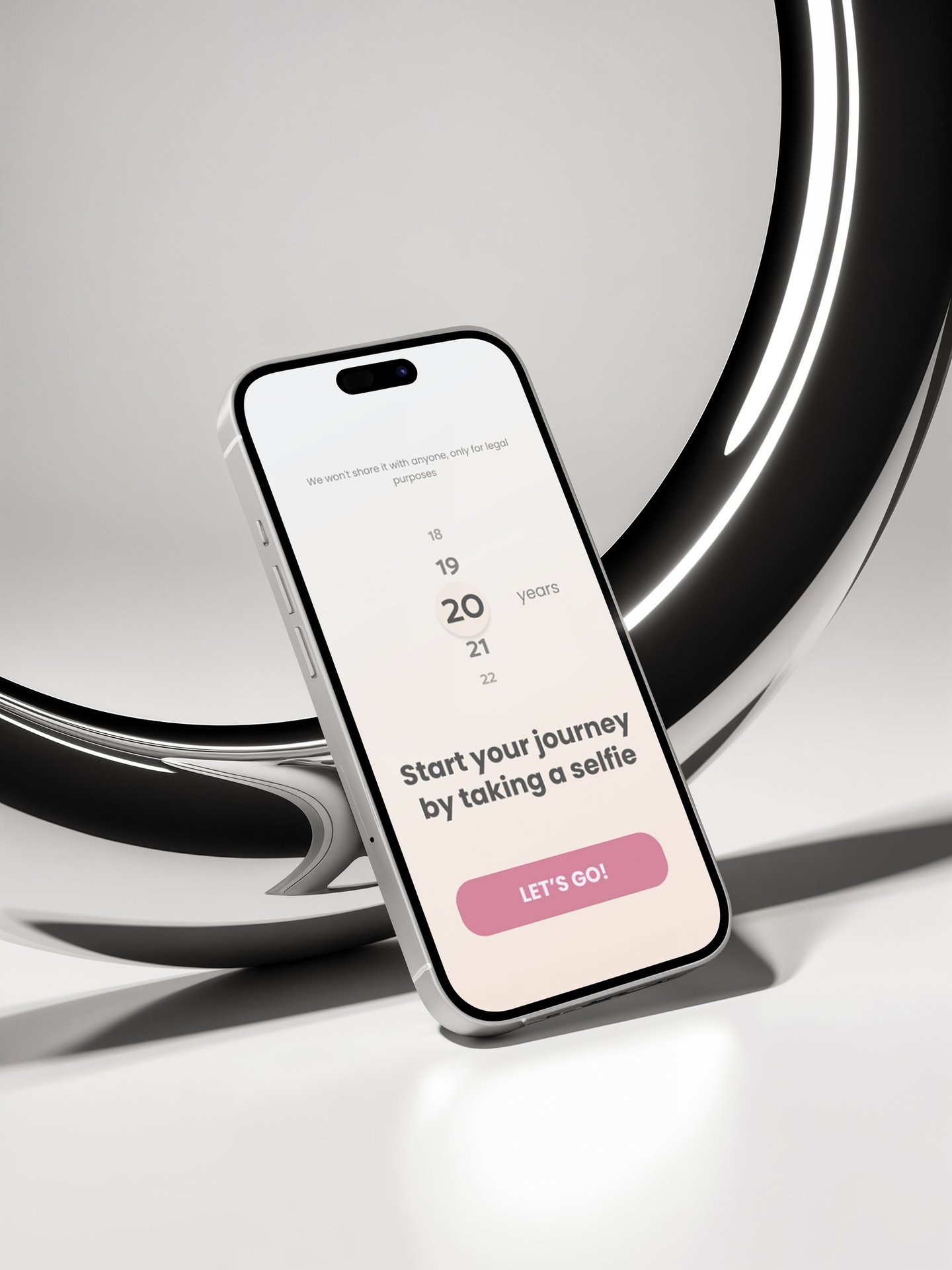
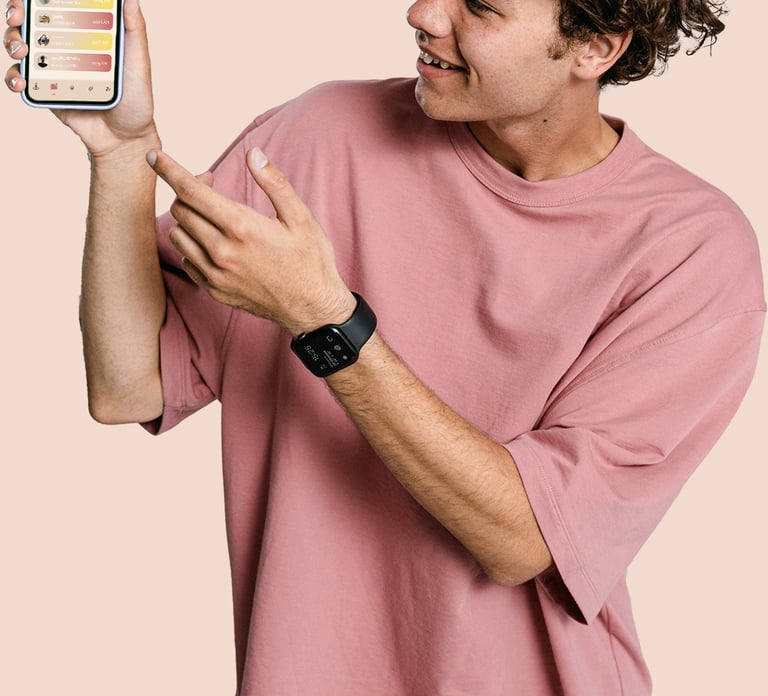
"The app should look simple and modern. Suggest some variants and we will choose the best one ."
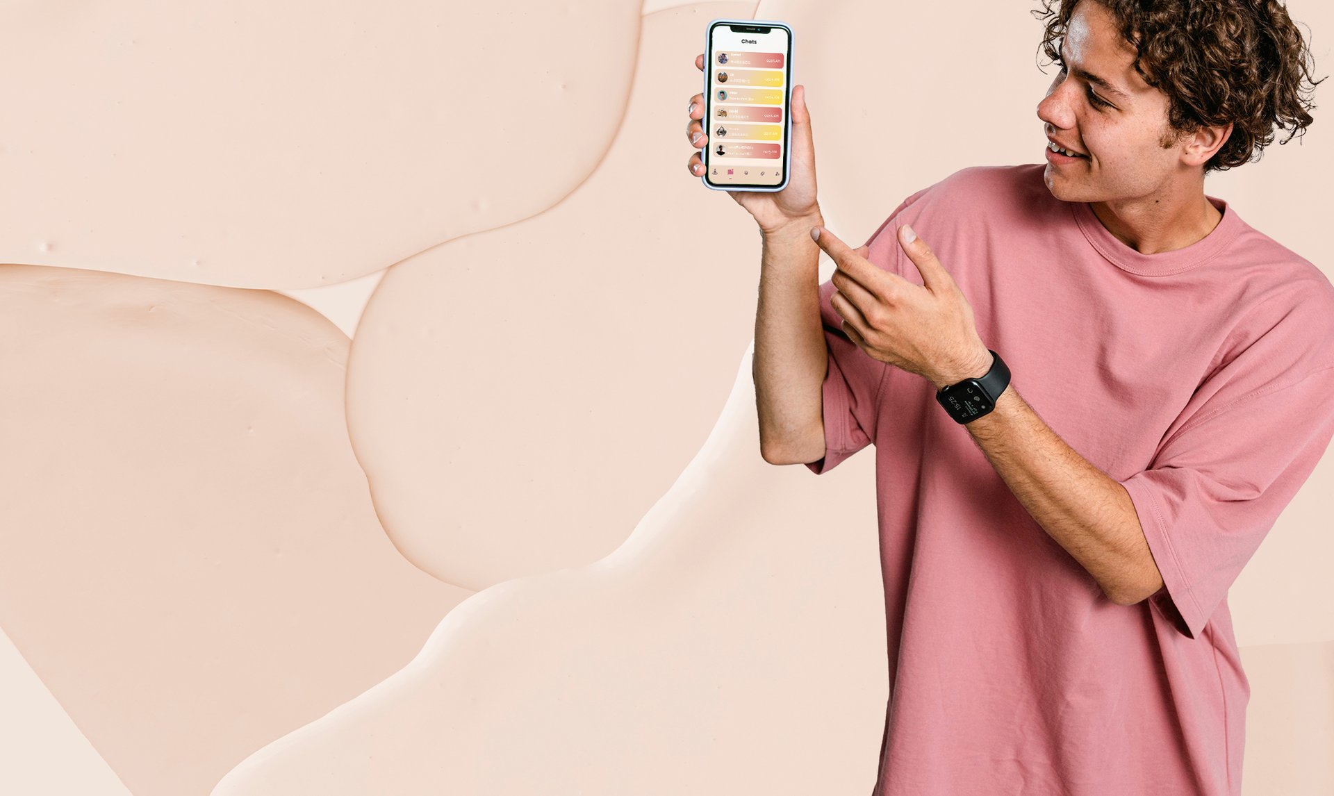
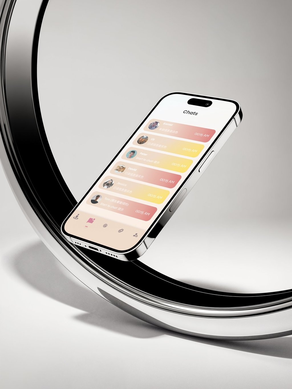
In the main menu, you can find people near you. The yellow icon is to suggest friendship and the red icon is to mark the person you like.

A must-read
In general this app is still being tested and is still in development so it has not been released to platforms yet
The design may still be changing but that doesn't stop me from sharing a little bit of development and a little bit about the app
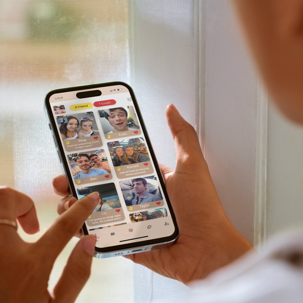
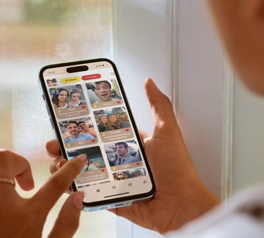
The idea of the app is to find dating from anywhere in the world. In the app you can find both friends and a partner for a relationship
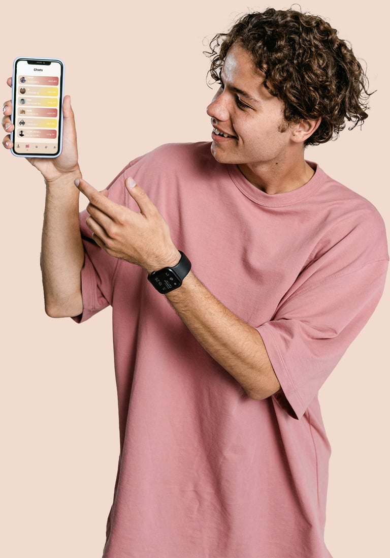
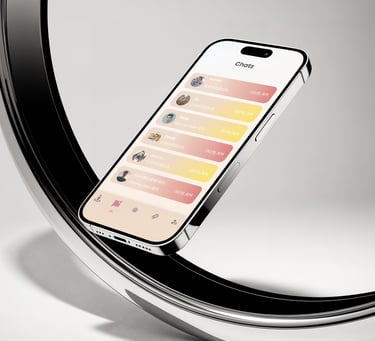
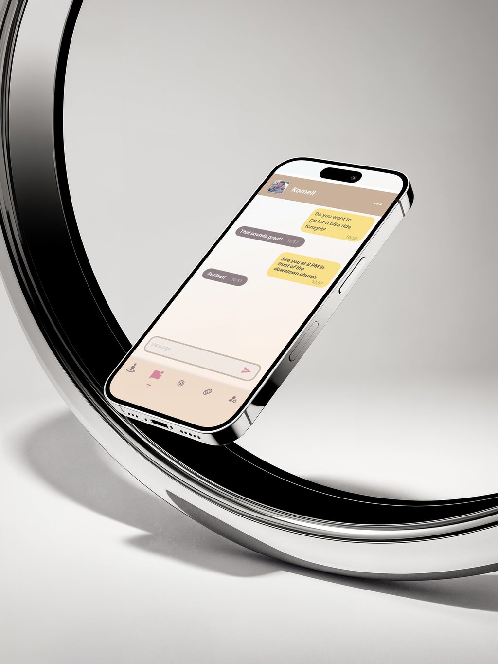
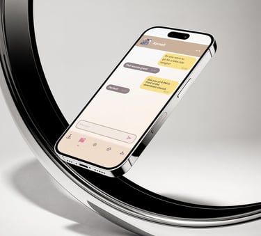
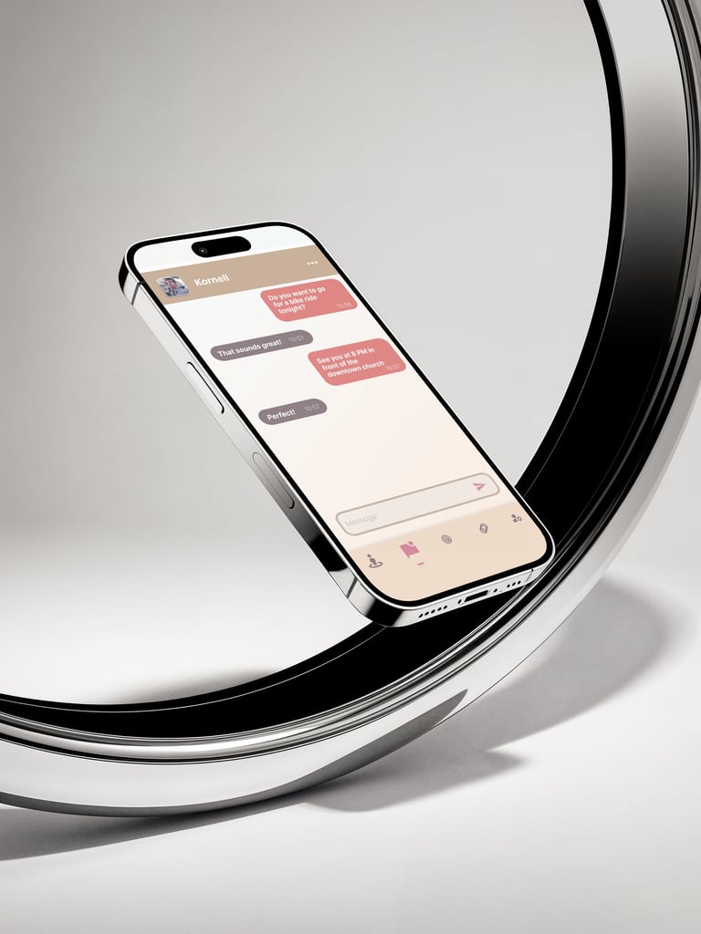
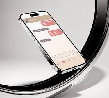
And not to get lost who you liked and with whom you just want to be friends, the chat will also be marked in the form of these colours.
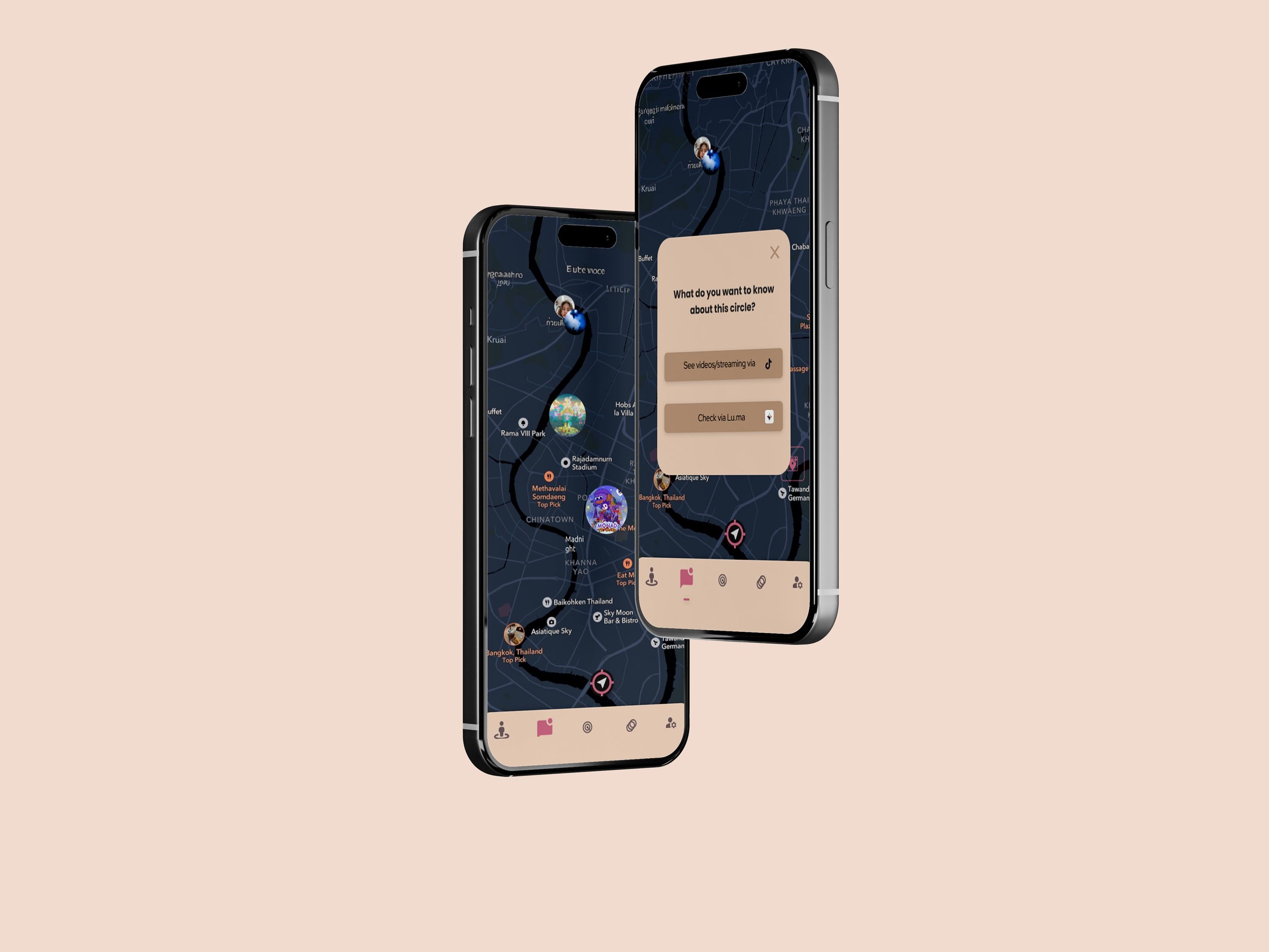
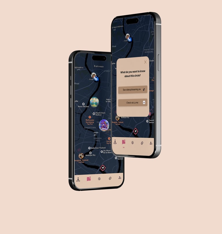
One of the distinctive features of this application will be ‘circles’ - these are meeting places that you can mark on the map and everyone can join you.
The colours of the messages will also be different so that there will be no confusion for sure. Yellow is your friend and red is your crash.
If you want to have a party or just go out but have no-one to go out with, you can put a reply!
At the time of development this is the maximum I can share so will wait for an update and release on the plarforms:)